How to Judge a Book by Its Cover: 19th- and 20th-Century Cloth Bookbindings
Date:
1 February 2009 – 30 May 2009
Location: Dome Room, UVA Rotunda
Curated by: Theresa Goodman '12
Content based on B-90: Publishers’ Bookbindings, 1830–1910, taught by Sue Allen and assisted by Vincent Golden in summer 2008.
This exhibition traces the evolution of book cover design and technology from 1830 to 1910, the heyday of cloth bindings in America. Book cloth was invented in the early 1820s, and rapidly superseded other materials: it was cheaper than leather, but more durable than paper. Dust jackets were introduced near the end of the nineteenth century, and by the 1920s the jackets were decorated far more heavily than boards. But between 1830 and 1910, cloth covers were the first thing a customer saw, and bookbinders worked to make the covers attractive. The nineteenth century saw a wide range of decorative designs, fueled by the evolution of technology and taste. Each decade developed a recognizable style, which means that the date and often the intended use of a nineteenth century cloth-bound book can easily be judged by its cover.
 This exhibition gives a chronological history of technological innovations and aesthetic developments. Here I’d like to point out the general areas of innovation, key points to examine when trying to judge a book by its cover: the cloth, the design, labels, monograms, the dust jacket, and end papers.
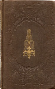
Obviously, the place to start when examining a cloth binding is the cloth, which by its color and texture provides a few basic clues as to the date. Early cloth, from the 1830s, came in dark, sober colors: maroon, plum, navy. Richer and bolder colors appeared in the 40s and 50s, and in the early 60s a petroleum-based dye (called aniline) was developed that allowed for much brighter colors, which seem almost neon when compared to earlier shades. Aniline dyes went out of fashion after a few years, to be replaced by more restful shades. By the 90s, the color of the cloth was part of the cover image–or entirely superseded by blocking.
The texture or grain of book-cloth can also indicate its date. Very early cloth was smooth, but soon subtle grains were introduced. In the early 30s and 40s, a rare type of cloth called “ribbon-embossed” was sometimes used. Ribbon-embossed cloth sported a raised pattern, generally a floral motif. This sort of cloth went out of style as blocking became more prevalent in the 40s, but pronounced grains remained in fashion throughout the 50s. The tide turned in the 60s: grains became more subtle and less varied, and by the 70s most books had a “silk” grain. Ribbed grains saw a revival in the 80s and 90s, but by the turn of the century grains were abandoned altogether.
Cloth color and grain are all very well, but of course most of the interest of a book cover lies in the design stamped or “blocked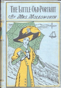 ” onto the cover. A way to block covers was discovered in the early 30s, but few books from the period show much decoration. Sometimes the covers were printed with information from the title page, but due to the nature of the ink, that experiment failed. Often paper labels, containing the title and author of the book, were glued to the spine or front cover. More expensive books were blocked with gold, which became more common in the 40s and much more common in the 50s. Due to the abundance of gold provided by the gold rush of 1849, books from the 50s could be heavily blocked with gold (sometimes beyond the bounds of taste). Blocking with silver was also attempted, but abandoned when it was seen that silver tarnished on the book. But this enthusiasm was lost in the 60s, when the Civil War drove prices up and binders had to economize. In the late 60s, binders discovered how to block with black ink, which soon became common. Designs in the 70s were more asymmetrical than had previously been seen, and often had a spiky feel to them, inspired by Japanese styles and influenced by the architect Charles Eastlake. At this time other colors were adapted for blocking, and 80s books took full advantage of this, often presenting numerous vignettes layered over each other. For the first time, book covers began to be subject-specific. By the 90s design became a little more toned down, and the cover designs took on a two-dimensional poster aesthetic, influenced by artistic movements of the time. Paper labels reappeared–but instead of supplying information about the book, they often were printed with colorful illustrations that supplement the blocking. During this decade, individual designers became well-known, and the resulting covers could be beautiful.
As dust jackets made their appearance, cover decoration became less and less important.
Dust jackets originated in the late nineteenth century. Early jackets were simply for protection, and were often discarded. The few that survive are very plain. But soon jackets began to act as advertisements; some were printed with blurbs about the books they covered, or about other titles circulated by the same publishing house. Eventually jackets were decorated with pictures. Sometimes the images stamped on the cover were replicated on the jacket, but eventually the jacket was decorated much more heavily than the book cover.